
My dad is terrible at telling jokes. He is the type of joker who tells the punchline straight up. Sometimes, he’ll get halfway through and then, bam, punchline. Occasionally, he’ll forget the punchline completely, leaving you feeling awkwardly confused and slightly annoyed.
Dad’s terrible at jokes because he forgets the fundamental rule: follow a well-defined narrative structure. By departing from this structure, his jokes fail horribly.
Science is rarely a joke, but we can learn a lot about visually communicating science from my dad’s joke mishaps. Specifically, the order in which we present information matters.
You know this intimately from the assignments, journal articles, and reports that you write. Introduction first, then methods, results, discussion, conclusion, etc. Suppose you don’t summarise the overall topic of your paper in the first one to two sentences of your introduction. In that case, you are casting the reader into an ocean of information without a tether to land.
The order in which we present information matters in graphics, too, especially if the graphic tells a complex story.
Here is the take-home for today; we can influence the order that information in a graphic is seen through its aesthetics and positioning. Some elements will grab your attention before others because they are bold, large, or in a prime position:
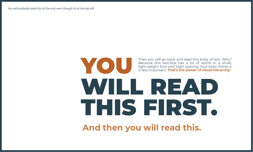
When I tested this image on a friend, she argued that maybe the words were directing you more than the design. Spoiler, they’re not. Your eyes are drawn to certain areas before you read them. In the interest of science, let’s change that variable and re-run the test:
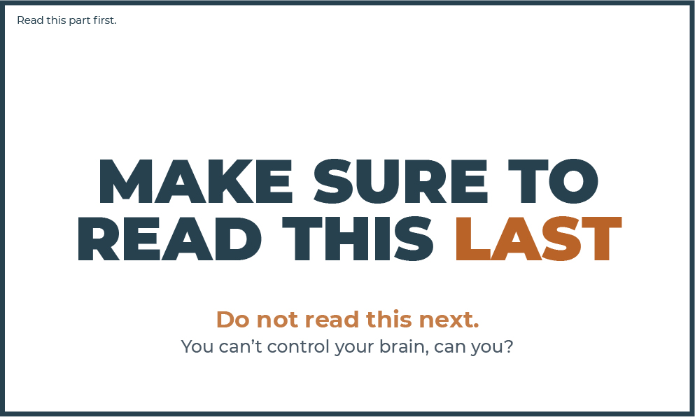
Did I break your brain a little?
This is the power of visual hierarchy. It allows you to design a graphic so that certain information is likely to be seen before others, thereby influencing how people navigate your visual. If done right, you can guide them through a sequential message (aka a structured narrative), just like telling a good joke or story1,2,3.
Achieving a good visual hierarchy can be tricky. There is a lot to it. Here, I want to get you thinking about visual hierarchy and explore ways to make it work in your favour. The more you play with this, the better you will become, and your graphics will be more powerful.
Visual Hierarchy Case Study
To create visual hierarchy, you need to
- clearly understand the story you want to tell,
- think about the layout and how the eye flows through it, and
- create contrast while keeping the hierarchy of the elements simple and consistent.
Let’s break this down step-by-step, using a conference poster as an example.
Conference posters are challenging because you have only limited space and a lot of information to get across. They are often text- and image-heavy. This isn’t always a bad thing, especially if you use visual hierarchy to help guide the viewer around the poster.
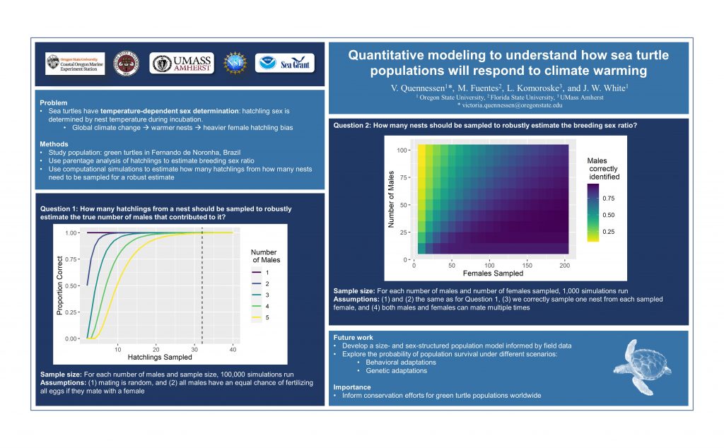
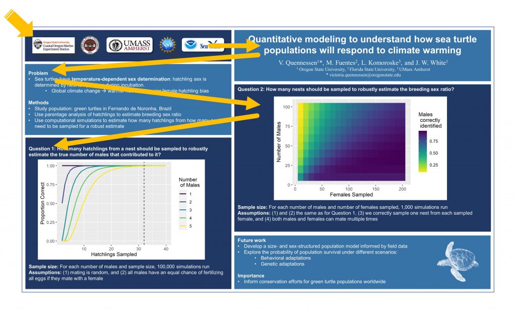
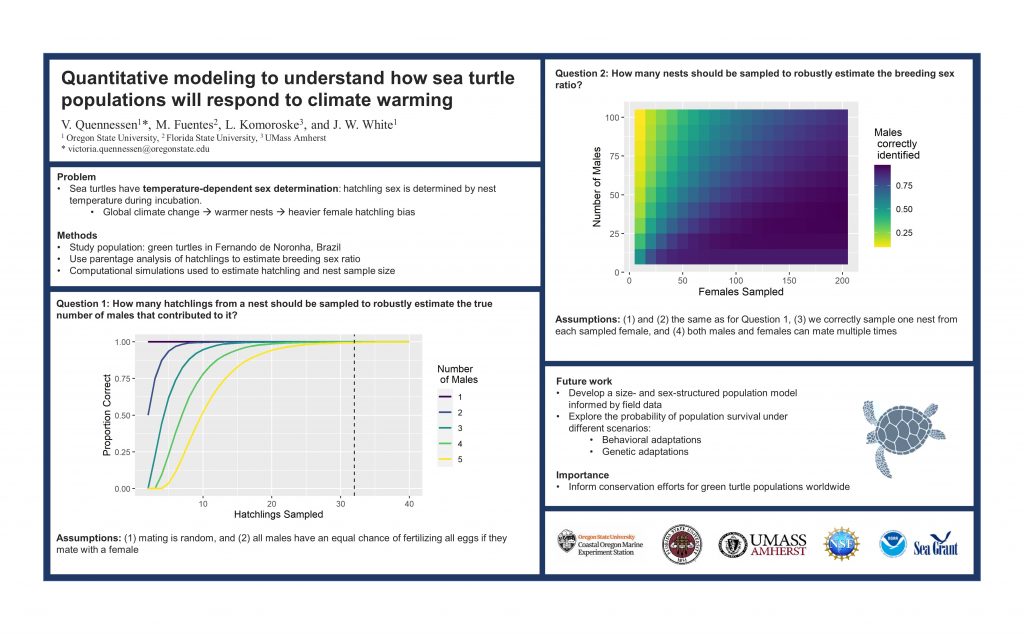
The poster we will use is a modification of one created by a colleague of mine, Victoria (Vic) Quennessen . Vic kindly volunteered her work for this post; thank you, Vic! This is the first draft of her poster:
Step 1 – Rank your information
There is no point in striving to achieve a clear visual hierarchy without knowing what story you want to tell.
You need to ask yourself, what do people need to know first, second, third, and fourth?
A classic conference poster will have sections like a journal article: title, introduction, methods, results, discussion etc. Following this template, Vic’s sections were title, authors and affiliations, problem, methods, question 1 (results), question 2 (results), future work, importance, and funders.
Ideally, Vic wants to grab the viewers’ attention, have them read the title first, and then guide them sequentially through the sections. She also needs to give them the option to skip to specific sections – for example, they might want to focus on the broader implications of the work before delving into the methods.
Some sections have section titles to aid navigation, which should be easily distinguishable from the body (main text or figure). Like above, when it comes to directing our eyes around the page, the words in the subtitles don’t matter as much as the font’s characteristics.
Note there are layers of information hierarchy to consider here! There is information about the science itself and then information about the story’s structure (e.g., section headings). We want to use the latter to guide the former.
Step 2 – Layout to support easy navigation
When presented with a new visual, our brain will scan and search for a point of entry4. We tend to start in the top left corner, moving right and down in Western cultures. This is especially true for evenly distributed, homogenous information – like text-heavy designs5.
[As a side note, there has been an enormous amount of research into how eyes move around different compositions, especially in web design. If you’re interested in delving into this, work done by the Nielsen Norman Group is an excellent place to start.]
When people first meet a conference poster (or any text-heavy graphic), they will not read every word in order. Instead, they will scan around for important words or indicators that give them the information they want. The title, section headings, and figures are the indicators for posters. After that, people will read the fine print. You probably already know this, but we sometimes forget the obvious when deep in the details.
Back to Vic’s poster.
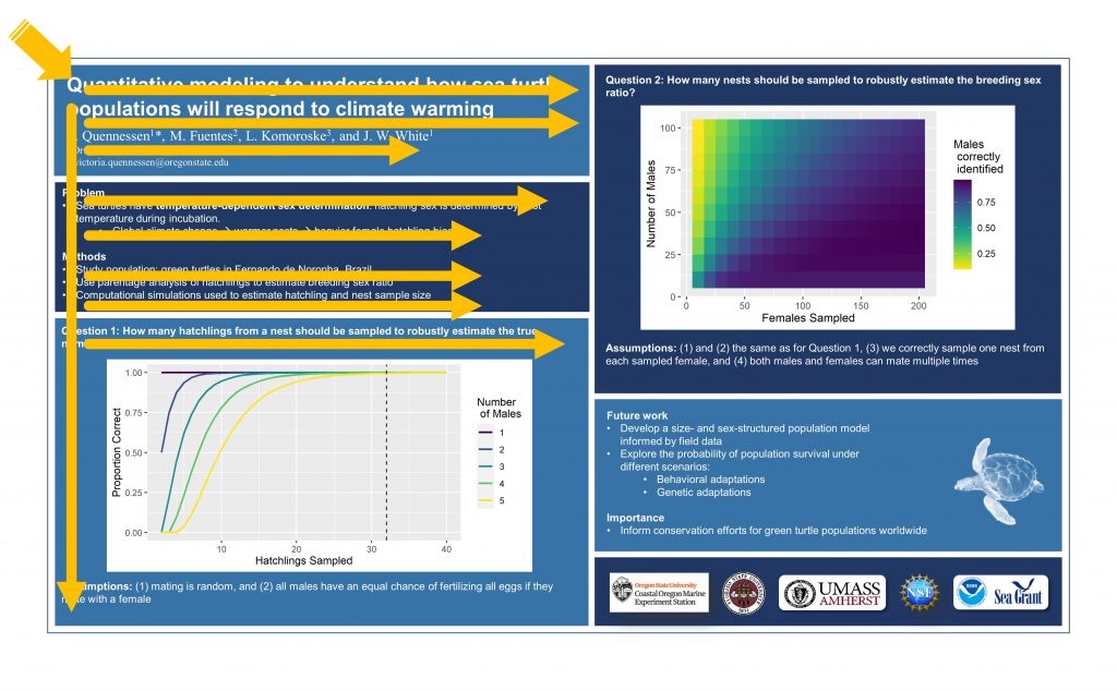
Because the poster is information-heavy, with homogenous aesthetics, we look to the top left to start. As it stands, the first things we see are the university and funder logos – not really what we expect. Where to go next is a bit confusing. The title on the right in large, bold font grabs our attention. However, because Vic has used a two-column layout (not necessarily a bad thing), the break between columns interrupts our eye flow. It suggests that we go to the section below the logos rather than to the right.
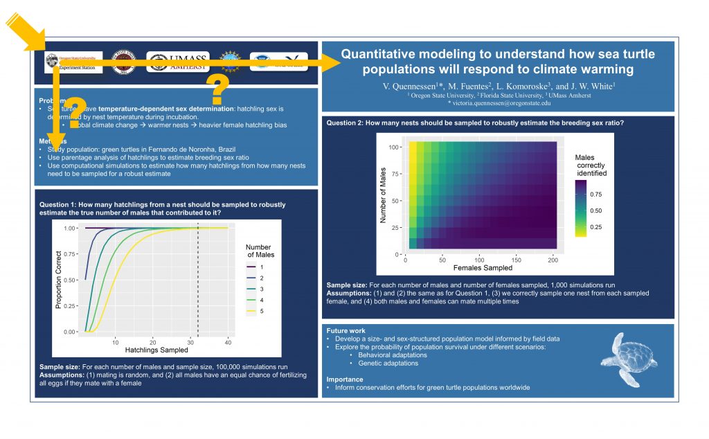
Both paths get us into trouble. If we go to the title and then back to the first column and zigzag down, the sections read logos, title, problem/methods, question 2, question 1, future work/importance.
If we follow the column structure, the sections read logo, problem/methods Question 1, title, question 2, future work/importance.
Either way, we are left a little confused about the story.
Thankfully, there is a simple fix. We can rearrange Vic’s poster to have a more logical flow. Note that this is one of many ways we could have changed the layout – the Better Posters blog has some good discussions on layout and other poster-related things.
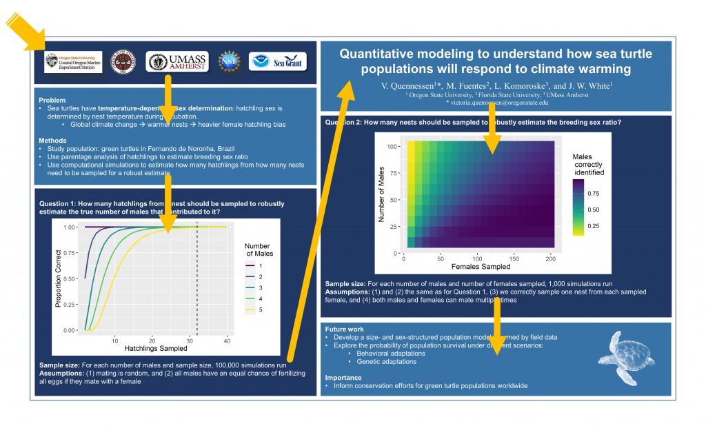
This is how the info is now likely to be read:
Step 3 – Use contrast to rank information
Layout is only one aspect of the design that influences how our poster (or graphic) is navigated – and it’s not necessarily the strongest. As I demonstrated in the first example of this post, a sentence in the top left of the image can be ignored entirely if other elements demand our attention first. This is where visual hierarchy can really pack a punch.
Let’s revisit what visual hierarchy exactly means.
Renee Stevens6 has a great definition: “the creation of an organisational system for content that involves emphasising some data and diminishing other data”.
While layout plays a part in this, contrast is essential. Some information needs to be emphasised, and others diminished. Equality in the visual weight of objects leads to poor design7.
Beware though! Don’t make everything different; there needs to be consistency across similar objects (i.e., section headings in a poster). If everything is different, then contrast gets lost.
Here are some general rules of thumb to make sure that you are achieving a good level of contrast:
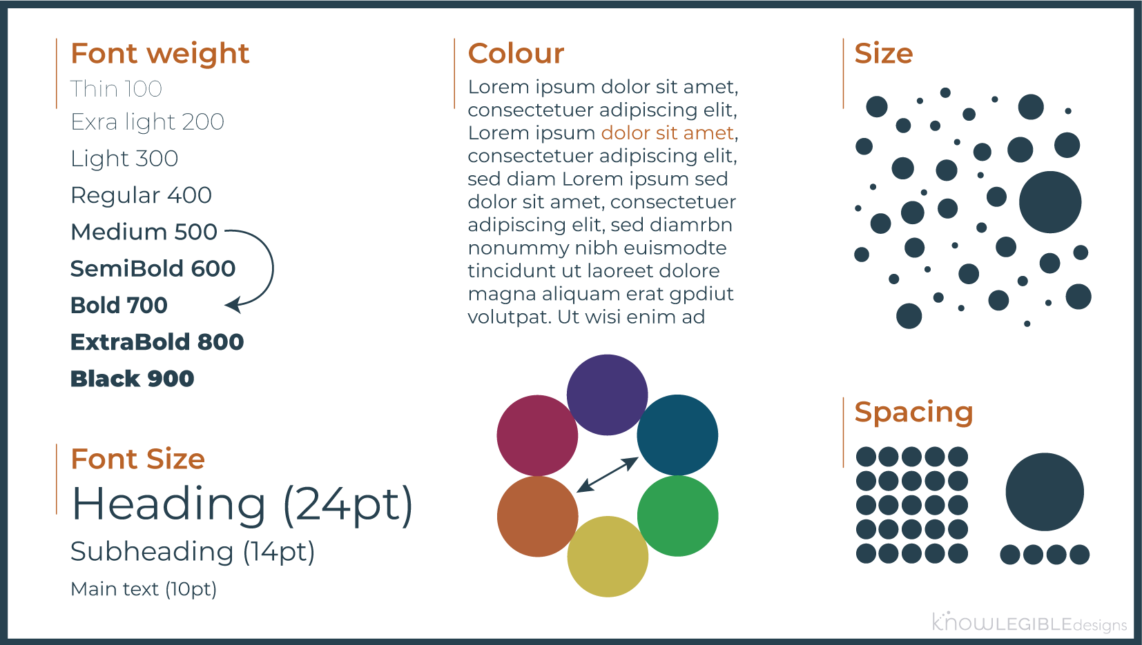
- Font weight – skip at least one weight (PowerPoint only gives you limited options).
- Font size – at least double for headings and minimum 2pts between other contrasting elements, but keep a minimum number of font sizes in your design.
- Colour – use colours contrasting on the colour wheel (these are opposite each other). Warmer colours (red, orange, and yellow) will draw attention first.
- Object size – objects need to be at least 30% larger to be contrasting (note, I haven’t found any confirmation of this, I am just going off my experience here).
- Spacing objects – group objects that are related and leave generous space between objects/groups. This helps to emphasise any contrast you have created.
Combining aesthetics can be helpful, but be careful not to overdo things. You don’t need a super large title in extrabold.
Back to Vic’s poster.

What’s grabbing your attention?
It’s probably the figures because they contain bright, contrasting colours compared to the blue background (an aside, good colour palette for the figures, Vic). Moreso, they are surrounded by a white box that is stark against the darker blues. We want the figures to be appealing, but currently, they stand out a bit too much.
We have two options here, remove the white background from the figures or change the poster’s background to white.
I recommend the latter for two reasons. First, it would be challenging to get the figures to look decent on the dark poster background (e.g., the text may need to be white). Second, light text on a dark background is prone to accessibility issues: dark text on a light background is usually easier to read and healthier for your eyes8, making it the more accessible option.
If you are really attached to a dark poster background, make sure you check for good contrast between the text and the background using a site like this or this. You can increase contrast by enlarging the font, increasing the weight, and changing the colour.
Here is the poster update. The figures are still eye-catching, but no longer shouting at you.
Lastly, let’s look at the visual hierarchy of the text in Vic’s poster. She has done an excellent job of ensuring a consistent difference between the aesthetics of the poster title, the section titles, and the main body of text. However, the contrast between levels is a bit too low to establish a clear hierarchy.
I cannot stress this enough, do not be afraid of scale when establishing visual hierarchy!
Following our rules of thumb (above), the heading (poster title) should be at least twice the size, and subheadings at least two ‘steps’ larger than the body text. I use steps here to refer to the increments that PowerPoint uses in font size; between 10pt and 20pt, PowerPoint jumps in 2pt increments, so two steps would be 10pt -> 12pt -> 14pt.
Currently, Vic’s poster title is 20pt, and the section headings and body text are 10.5 pt. Since there is a lot of text and the audience can zoom in on the poster, let’s make the body text 10pt to give everything a bit more breathing room. The font in the heading is twice that of the body, so that’s good. The main thing we need to change is the section titles; we’ll make them 14pt.
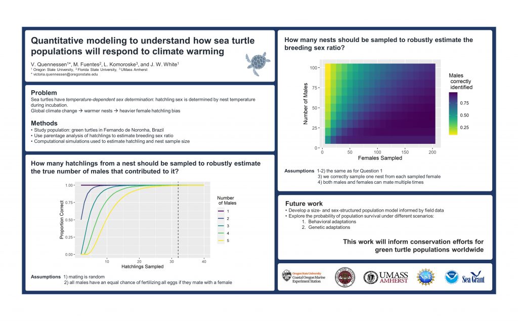
I have also changed the author names and affiliate font to match the rest of the poster, cleaned up some alignment, added a little more space around sections, removed some unnecessary bullet points, and combined the last two sections. Lastly, I rounded the edges of each section to soften the overall feel of the poster.
The poster now feels a little less cluttered. The section titles sit more clearly in a hierarchical space between the title and the body.
You may have noticed that I also moved the turtle image to the title section. Images of your study subject always help viewers quickly identify what you are talking about. Here, I also wanted to use the turtle to help eye flow. We naturally follow where things (e.g., people, animals) are looking or moving in an image. Because the turtle is looking down and left, this is a subtle indication that down and left is the next place to move your eye.
OK. So, there is more that we could do. For now, we have achieved our primary goal: improving how the poster is visually navigated. The title is clear and in a logical spot to catch your eye, and the rest of the information flows on nicely. The section headings stand out enough to let you quickly scan to the section you are interested in. The figures are eye-catching without being too loud or distracting.
What do you think?
Final comments
We have just scratched the surface of achieving a good visual hierarchy in your graphics.
To sum up, remember that you can significantly influence how your graphic is read by creating a solid layout and a balanced contrast between elements. Larger, bolder things will get more attention, but don’t make everything big and bold; that defeats the purpose of contrast.
Lastly, get friends/colleagues to look over your poster. Before you show them ask them to make a note of where their eyes are first drawn to and then where they go next. This can help you understand the consequence of your chosen layout. I always ask for this type of feedback on designs, it’s scary but necessary.
I want this blog to be useful and interesting for you! If you have a question about creating visuals for science, or a concept you would like to learn more about, reach out on Twitter by tagging me @KnowlegibleDsg. If I don’t know the answer, we’ll figure it out together.
Want to know when a new post comes out? Join the mailing list here.
Don’t forget to share this with others who would find this helpful!
Thanks for being here,
Jess
More Reading
| ↑1, ↑6 | Stevens, R., 2020. Powered by Design. Rocky Nook, Inc.. |
|---|---|
| ↑2 | Lupton, E. and Phillips, J.C., 2008. Graphic design: The new basics. Princeton Architectural Press. |
| ↑3, ↑4, ↑7 | Urano, Y., Kurosu, A., Henselman-Petrusek, G. and Todorov, A., 2021. Visual hierarchy relates to impressions of good design. |
| ↑5 | Lidwell, W., Holden, K. and Butler, J., 2010. Universal principles of design, revised and updated: 125 ways to enhance usability, influence perception, increase appeal, make better design decisions, and teach through design. Rockport Pub. |
| ↑8 | Matula, R.A., 1981. Effects of visual display units on the eyes: A bibliography (1972-1980). Human Factors, 23(5), pp.581-586. |