
Every time I give a talk or presentation, someone asks what design program I use.
“Adobe Illustrator”, I dutifully answer with a slightly sinking feeling.
The sinking feeling is because I find this answer very misleading. I do use Illustrator (mostly). However, I think you are really asking, “How do I learn to do what you do?” and the answer is not as simple as “learn Adobe Illustrator“.
You really need to learn the graphic design basics. You need to understand how objects interact in a design to tell a story and how humans perceive and interpret the outcomes of those interactions. Design programs are just tools that let you design faster and more efficiently.
It’s like learning statistics. You don’t expect that learning R, SPSS, SAS or any other program will teach you how to be a good statistician. Doing statistics by hand, however, really really sucks, so using a stats program does help immensely.
So, I argue that if you are going to learn a design program, learn how to use it alongside learning the basic graphic design principles.
To help you on that journey, here are three basic design principles (Alignment, Layers, and Colour) and where to find the relevant tools in different design programs. I see a lot of scientific visuals that could be vastly improved by considering just one of these.
In this post, I focus on Adobe Illustrator because it’s the most powerful and the industry standard. Illustrator, however, is not very accessible unless your university/organisation has an institutional subscription, so I’ll also show you the equivalent tools in two alternative programs:
- Affinity Designer, which is far more affordable (you only pay once, no ongoing subscription!) and still very powerful, and
- Microsoft PowerPoint, which is available to 99% of people through their host organisation. Yes, you can still do a lot with PowerPoint.
I am not in any way affiliated with any of these programs.
1. Alignment
“Alignment: The placement of elements such that edges line up along common rows or columns, or their bodies along a common center.”1
Elements in a design should be aligned with one or more other elements. This creates a sense of cohesion throughout the visual. Alignment can also help guide a viewer through the visual hierarchy of the design, aiding storytelling.
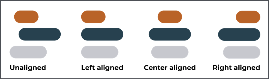
Poor alignment is one of the most common issues I see with scientific visuals, especially poster design. If sections of a poster are even slightly out of alignment, the poster can feel messy and unprofessional.
If your visual feels slightly off, look to create common edges through alignment.
Thankfully you don’t need to get a ruler up against the screen to ensure objects are aligned; all (decent) design programs have alignment tools.
How to: In all programs, you first need to select all the objects you want to align (only then will the align options be available).
Adobe Illustrator
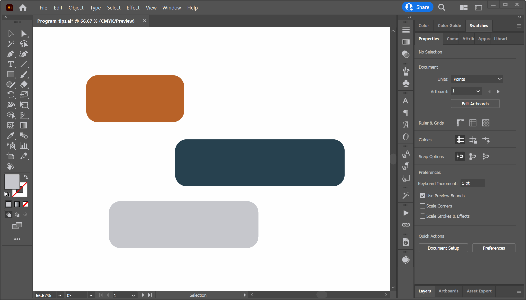
Alternatively, Select objects -> [Object] -> [Align]. Here is the help file on aligning objects in Adobe Illustrator.
Affinity Designer
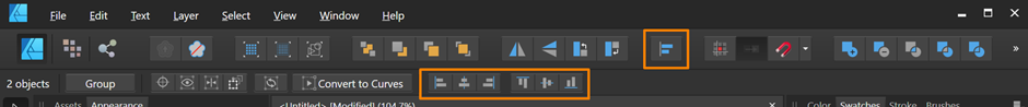
Here is the tutorial on aligning objects in Affinity Designer.
MS PowerPoint
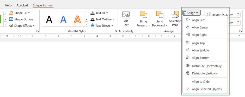
Here is the tutorial on aligning objects in MS PowerPoint.
2. Layers
“Layering: The process of organising information into related groupings in order to manage complexity and reinforce relationships in the information.”2
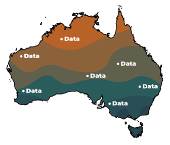
Layering is a powerful way to organise information in a design and create relationships between elements. Overlaying information/data on a map, for example, uses layers to directly relate a data point to a specific place. Objects on the top layer (‘closest’ to you) are commonly perceived as the most important or novel.
Behind the scenes, design programs have extended the layer concept to include layers as part of the program interface. Here, think of layers like transparent folders full of transparent sheets of paper stacked on top of each other. Each sheet has a different design aspect (images, text, data points, etc.) and the folders (layers) keep the sheets organised. When stacked together, they form the fished visual.
The great thing about layers (in design programs) is that you can hide, lock, and rearrange their stacking order as you develop your design. This gives you a lot of power when working with a complicated visual. If, for example, you have a graphic with a large number of components, you can save yourself a lot of grief by organising the different sections into layers. Within each layer, you can create child layers to add more levels of organisation.
Adobe Illustrator
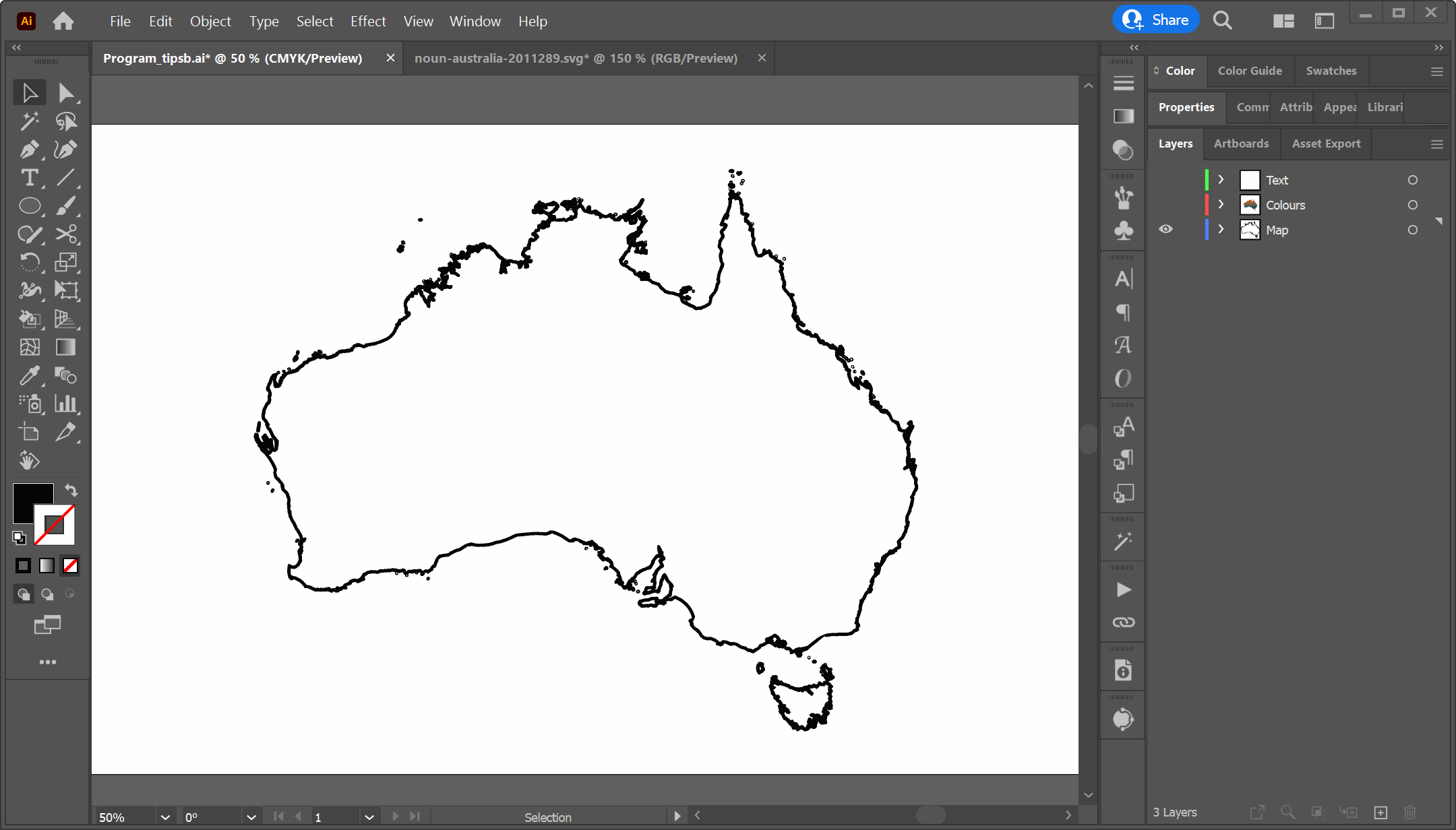
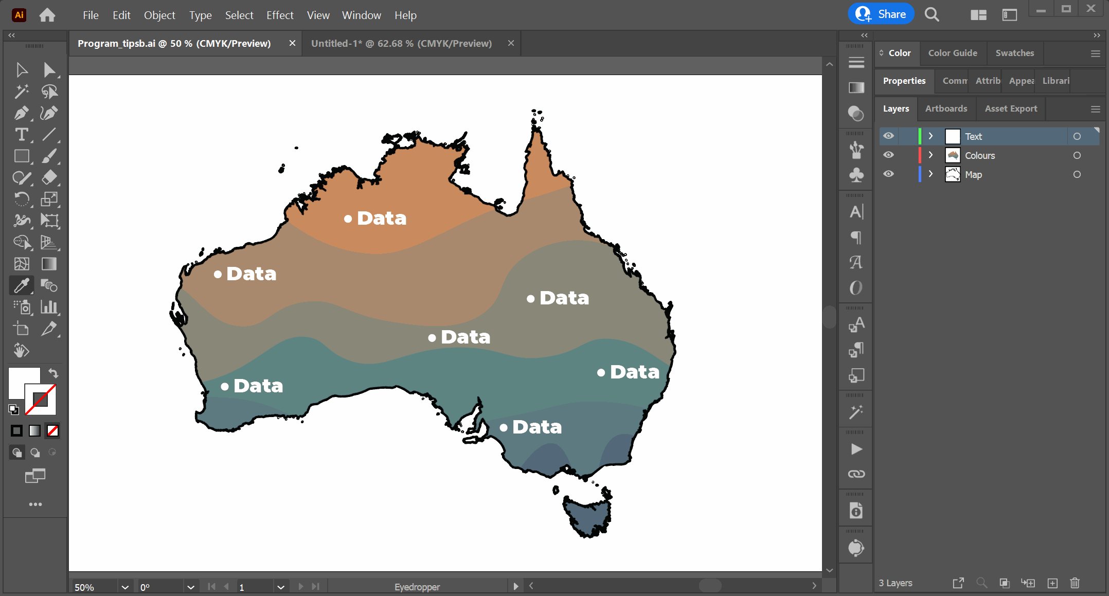
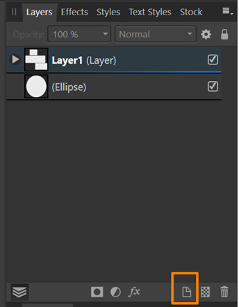
Look at this example I’ve created in Adobe Illustrator. There are three layers; 1) the map outline, 2) the colour, and 3) the text. The layers can be turned on (or off). They can also be locked to protect all the objects in that layer from change (click the padlock again to unlock).
To rearrange layers click the layer in the layer panel and drag it up or down. You can also move child layers to different parent layers this way.
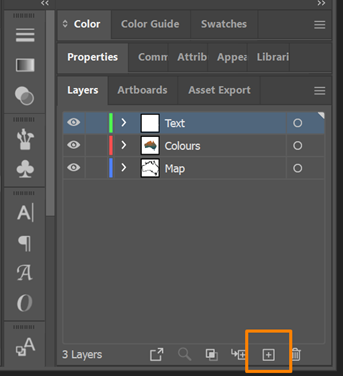
In Illustrator, every object you create is automatically placed into ‘Layer 1’. Click the new layer icon in the bottom right-hand corner (while the layers tab is selected) to add new layers.
Here is a tutorial for using layers in Adobe Illustrator.
Affinity Designer
Layers in Affinity Designer behave very similar to those in Adobe Illustrator. However, new objects will not automatically be placed in a layer – you need to create the first layer yourself.
Layers in Affinity also have clipping and masking capabilities (similar to how layers in Adobe Photoshop work). This is beyond the scope of this post, but follow the aforementioned links if you want to explore more.
Here is the tutorial for using layers in Affinity Designer.
MS PowerPoint
Layers per se are not a thing in MS Powerpoint. However, there are still the options to lock, hide, and rearrange individual or grouped objects via the ‘Selection Pane’.
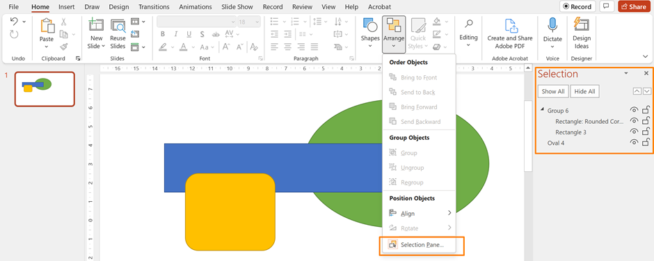
Depending on your version, you might not have all the locking and visibility options in PowerPoint. I think the new ability to lock objects is a HUGE improvement in Powerpoint, mainly because I find the selection of objects finicky at the best of times.
Here is the tutorial for layering objects in MS PowerPoint.
3. Colour
“Colour is used in design to attract attention, group elements, indicate meaning, and enhance aesthetics.” 3
Colour can make or break a scientific visual. Variation in colour implies meaning, and when this happens, the viewer will spend time seeking out that meaning (whether it is there or not).
Poorly considered colour choices can confuse and overwhelm, obscuring the main story of your visual. They can undermine trust in your graphic, potentially leading the audience to see your work as unprofessional:
Conversely, intelligently using well-chosen colours can facilitate understanding and connect ideas within your graphic. For example, consistently using the same colour for a concept can link ideas across multiple sections:
Let’s talk through some common issues regarding the use of colour and how you can use program features to help you.
3A. Number of colours.
Limit the colour palette that you use. Three colours are usually enough, five if you have a more complex visual. Images, illustrations, and data visualisations may use more colours, but it is still useful to use a set colour palette to help keep things organised and cohesive. More on using colour palettes below.
Often a visual with too many colours results from the creator trying to highlight multiple important aspects at once. The problem here is that the liberal use of contrasting colours will all compete for our attention, rendering them useless. See my post on Visual Hierarchy for a deeper discussion of this.
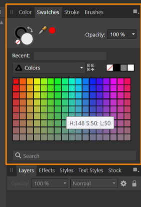
The best way to manage your colours in a design is to use the ‘Swatches’ tab in Adobe Illustrator and Affinity Designer (usually found on the right-hand side in both programs). PowerPoint is not well set up to deal with colour management, so I’m going to leave it out of this section.
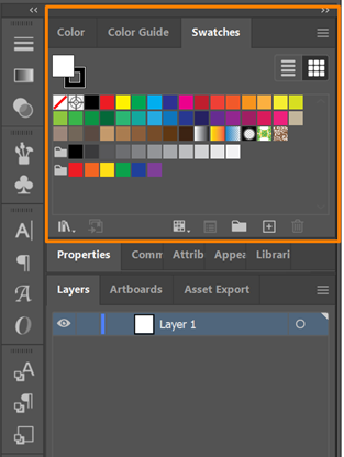
When you use a colour in your visual, I suggest adding that colour to the document’s colour palette. This way, you can keep track of the colours you are using and quickly find a colour you have used previously. This also limits your colour palette and ensures consistency in the design.
To create a colour palette (called colour groups) in Adobe Illustrator, go to the hamburger at the top right of the Swatches panel:
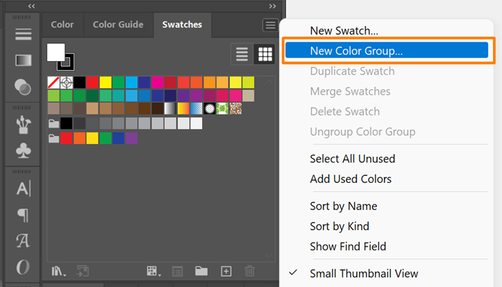
This will create a new group (indicated by the folder icon) below the current groups (in the above picture, there is already one group of greys and one of bright colours). The new group you create will be empty. To add a colour to your group, click and drag the swatch to that group.
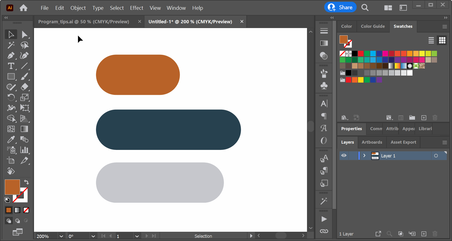
As a side note, the two swatches in the top left of the panel show the current colours you are using: the sold swatch is the fill colour, and the boxed swatch is the outline colour.
Here is the Adobe Illustrator help tutorial on swatches (and colours).
For Affinity Designer, the process is the same, but you are adding a new document palette. To add a new colour, click the icon:

Here is the Affinity Designer help tutorial on swatches.
3B. Colour palette
Every colour you use will be viewed relative to every other colour in your visual. This means that you need to consider your colour palette as a whole. Your colour palette will depend on what visual you create: data visualisations require different palette choices than posters and presentation slides.
The design programs we have been looking at have minimal tools for helping you choose your colour palette. I find them all a bit clunky, and I usually go outside the program to online tools for colour palette help. The type of visual I am working on will dictate what tool(s) I use. For example, in data visualisations, you need to align the palette with the type of data you are displaying. If using categorical data, you need a colour palette consisting of perceptually distant colours (clear distinctions between colours), which don’t imply order or magnitude (no colour is perceived as more important than any other). If you have ordinal data, you need a colour palette that implies order4.
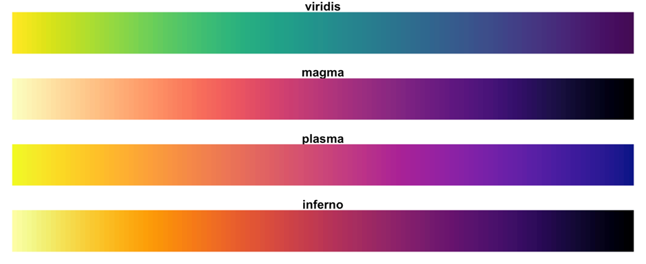
My go-to colour palettes for data visualisation are the Viridis palettes. They retain representational clarity in greyscale, are colour blind safe, and look pretty! If you want to create your own palette and have sequential or diverging data, Chroma.js Colour Palette Helper is helpful. For categorical data, Categorical is great. Any of the ColourBrewer palettes are also lovely.
In posters or presentation slides, you usually want a colour palette with one to two main colours and one colour to accent specific points. For this, the best place to start is looking at colour harmonies using a colour wheel. Complementary or split complementary colours (opposite hues on the colour wheel) are good harmonies to stick to.
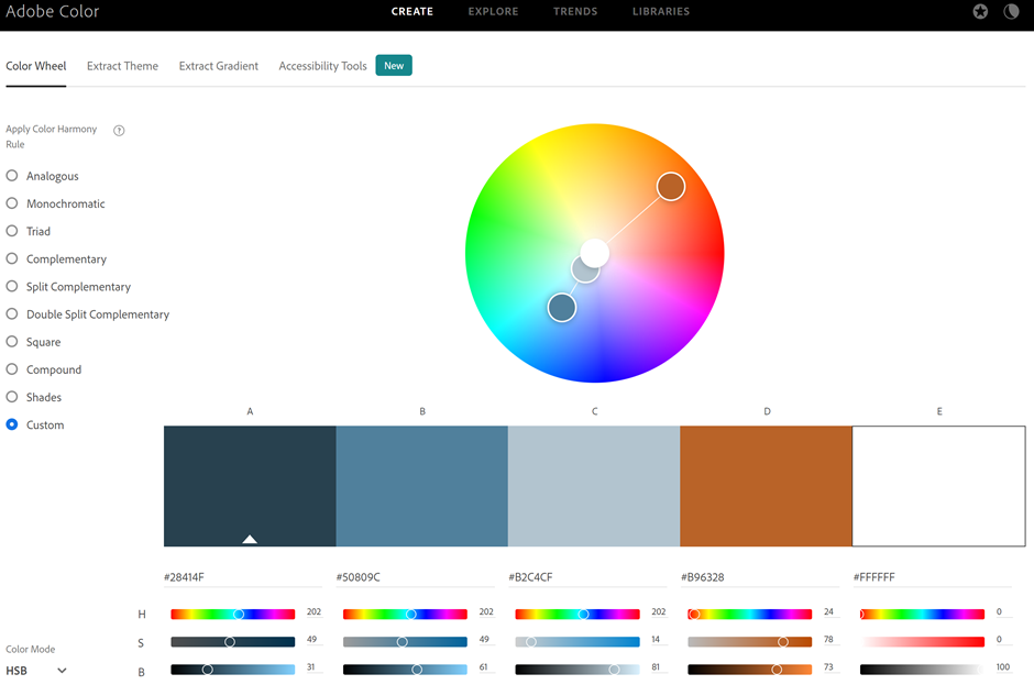
For example, here is a colour palette with one main colour (blue, hue = 202) with two variations (a darker navy and a lighter, more saturated grey-blue) and a complementary accent colour (ochre, hue = 24):

The screenshot below from the online (free) Adobe Colour tool shows where these colours fall on the colour wheel. Note that colour B is a lighter variation of A, so A and B sit in the same spot in this version of the colour wheel (there are different ways to represent a colour wheel).
3C. Colour accessibility
Having a great colour palette is pointless if it is not accessible to everyone. Some form of colour blindness affects up to 8% of the world’s population. By not considering whether your colour choices are colourblind safe, you ignore almost 1 in 10 of your audience.
Thankfully there are easy ways to check and fix your colours. Again, I often use (free) online tools for this.
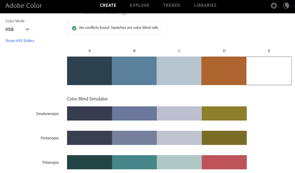
- Adobe Colour’s Accessibility Tools let you check if your colour palette is colour blind safe across the three major kinds of colour blindness. Thankfully our blue-orange palette from before passes the test (see screenshot below)! Unfortunately, Adobe Colour limits you to a max of 5 colours. This is fine with a limited palette but not so helpful for data vis, where we may need more.
- I only just discovered Viz Palette, and I think it’s fantastic! It is specifically designed to test colour palettes for data visualisations. It covers colour blindness, checks the colours in greyscale, and lets you know which colours might be hard to tell apart in different scenarios (e.g., when using thin lines or large areas). Amazing!
A less discussed issue with colour is contrast. In this context, I am talking about the minimum contrast between the background and foreground colours required for easy readability. This is especially important for large chunks of text, like in posters. If the text colour has low contrast compared to the background, it will make it harder for your audience to read (and they may give up).
While two colours opposite on the colour wheel may be aesthetically contrasting, they might not have sufficient contrast for readability.
Here’s what I mean. The orange in our example colour palette above is complementary to the blue. It causes tension that makes orange elements ‘pop’. However, using orange text on a blue background is a terrible idea:
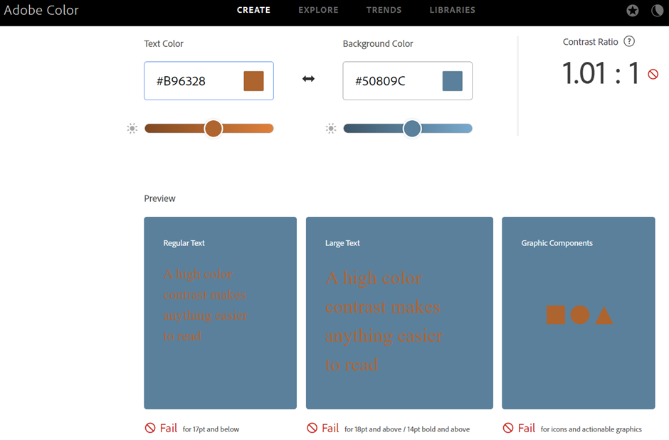
You can check contrast using Adobe Colour’s Accessibility tools or a checker like Contrast Checker.
D. Bonus: Recolour artwork
For reading this far you get a bonus prize?
A final colour tool that I want to point out is ‘Recolor Artwork’, which is only available in Adobe Illustrator. I use this tool a lot! It lets you recolour all or certain aspects of your design.
Note that you need to select the parts of your visual that you want to change before the Recolor button appears under the Properties panel.

Final words
Oph! I know this has been a long post.
This is definitely only the tip of the iceberg for design principles and design programs! Many excellent (paid) online courses and (free) YouTube videos are available to teach you either of these. Here, I really wanted to get you thinking about what it means to marry programs and principles together to create better scientific visuals.
If nothing else, remember that design programs are tools to help. They have been created with designers in mind, so most of their features will relate to one graphic design principle or another. I can already see a follow-up post or two…
I want this blog to be useful and interesting for you! If you have a question about creating visuals for science, or a concept you would like to learn more about, reach out on Twitter by tagging me @KnowlegibleDsg. If I don’t know the answer, we’ll figure it out together.
Want to know when a new post comes out? Join the mailing list here.
Don’t forget to share this with others who would find this helpful!
Thanks for being here,