
Think about the last excellent paper that you read.
What do you remember from it?
Like most people, you probably don’t remember the exact words or phrases. Instead, you probably remember the key ideas that the paper was about.
Good writing is not obvious. It fades into the background, acting as a vessel for great ideas and concepts. A well-written paper removes the effort of reading, allowing you the mental space to develop the ideas and link them to your understanding of the world. You will remember the concepts of a well-written paper long after you forget what was written.
In contrast, terrible writing is painfully apparent. You often need to re-read sentences multiple times to understand them. Poor writing demands your mental attention, taking it away from the key concepts. Think about the last poorly written paper you read. Do you remember the main ideas? Or do you remember the frustration of trying to read it? Did it take a lot of time and effort to understand?
Poor writing distracts from ideas, while good writing takes a backseat and lets ideas shine.
Visuals are the same. A well-designed visual will make the story centre stage, using visual techniques to distil and communicate rather than trying to be ‘flashy’.
Let’s look closer at the similarities between writing and designing visuals. I hope these will help you next time you get stuck creating a visual that isn’t working out how you would like.
By ‘visual’, I am referring to figures in a paper, graphical abstracts, conference posters, slides for a presentation, and anything else where you visually communicate your work.
A note: I am by no means a writing expert! But I constantly work on being a better writer; these examples are based on my continued journey to be a good writer and a great designer.
1. Flashy elements = wordy sentences
As an undergraduate, I thought that fancy words and complicated sentences made me look like a deep, intelligent thinker. Did you feel the same at one point (or still do)?
As my writing progressed and I started marking undergraduate papers, I learned how painful a paper full of complicated words and sentences can be. Rather than looking like a deep thinker, you are more likely to confuse (annoy) your reader and obscure the point you are trying to make. Sorry to break this to you if you weren’t already aware.
The words we use and how we use them (grammar and style) matter greatly. The same is true for graphical elements in a visual design!
In a poorly designed visual, the story is often lost behind over-designing. ‘Flashy’ elements are often used to make something eye-catching, but they end up distracting from the message.
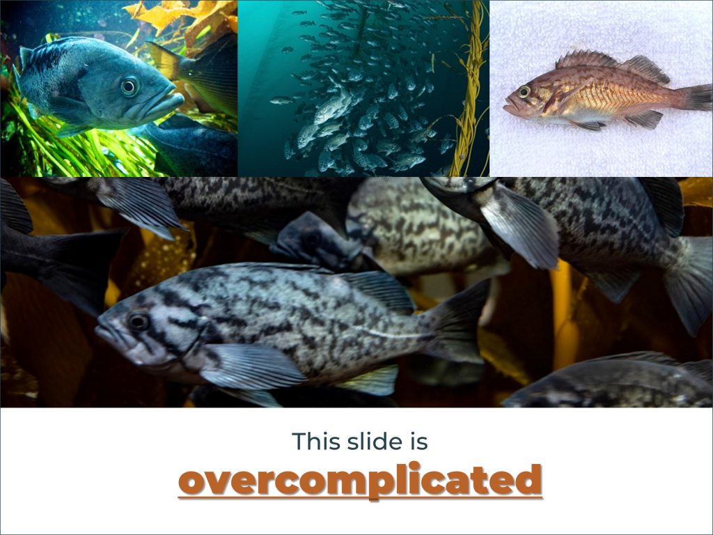
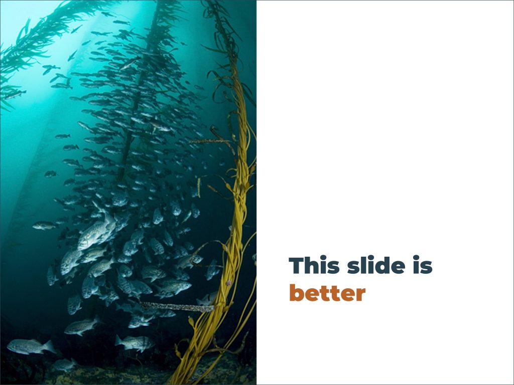
For example, to highlight a word or two on a PowerPoint slide, you don’t need to bold, underline, and recolour the text: just one of these things will do nicely. Likewise, twenty pictures of your study subject are a bit of an overkill when a single, well-chosen photo clearly conveys the point.
Like writing, the tendency to use unnecessary visual elements often comes from not understanding the rules and guidelines. The ‘grammar’ equivalents in graphic design are visual principles, which are based on how humans perceive the world around them. Different principles suit different situations and have different outcomes. Understanding when and where to use them takes time, practice, and many mistakes.
This book1 is a great place to start learning about these principles. You can also subscribe to this blog (e.g. here is a post about visual hierarchy) ?
2. Conveying a message/story
Often poor writing happens because we are unclear on the points we want to make. The less comfortable we are with a topic, the harder it is to write clearly. This is also true for visually communicating ideas: your figure/graphic/slide will not be effective if you are unclear on the main point you want to convey.
I want to stress that good visual communication goes beyond aesthetics – just like writing an excellent paper is more than well-chosen words and good grammar. Your writing/visual must have a purpose, and your main points must be clear and logically laid out. I talk more about this in my post on Why designing good visuals matters.
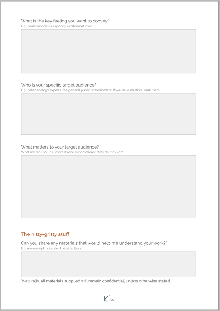
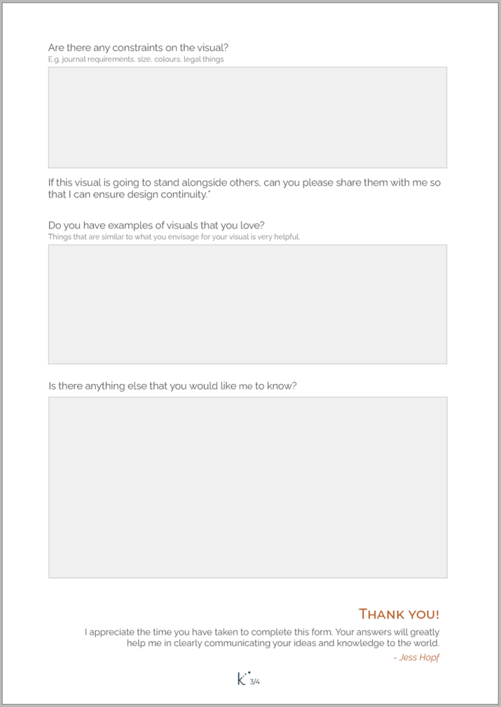
This is where developing a brief for your visual can be undeniably helpful. Forming a brief is like outlining a manuscript for publication and can be as formal or informal as you like.
When you are ready to write your manuscript, you don’t just write it up and submit it to the first journal that you like the look of (or I hope you don’t!). You go through a process that involves thinking about 1) the key outcomes of your study (is it contributing to a larger body of work, or is it novel?), 2) the context of the study (a study about whale poo will need a different journal than research on the human brain), 3) who the audience is (is it a niche study, or broadly applicable?), and 4) what constraints you have (can it be written up in 3000 – 5000 words, or will it need a journal that accepts longer papers?). Throughout the writing and submission process, you consistently refer to these questions.
Developing a brief for your figures (or slides) uses the same questions:
- Vision: What is the core purpose of your visual? What are you trying to accomplish? In a sentence, what is the main message you want to convey? (The last is a critical one!)
- Context: What is the background of the figure? Where does it fit in the broader story of your paper/presentation?
- Audience: Who is going to view your visual? What is their knowledge of the subject matter? Do they have experience with this type of visual? (e.g., not everyone will immediately understand a scatter plot, this is something scientists are trained to read quickly)
- Constraints: Where is the visual going to be used? Does the journal have size limits? Will your presentation be over Zoom and likely seen on a small screen?
Answering these questions will help inform even basic design choices, like font or stroke (line) size. They will also help you decide what elements to keep and remove when revising your work. Most importantly, they will help ensure you convey a clear message.
I ask very similar questions to my clients when we start a new project:

3. Revision, revision, revision
Excellent writing comes from lots and lots and lots of revision – it’s painful but true. Sometimes I wonder if you don’t get better at writing but better at revising…? Again, creating visuals is the same.
This point is really important, so listen up. Your first draft – and even the first few iterations – will probably suck.
Do not give up!
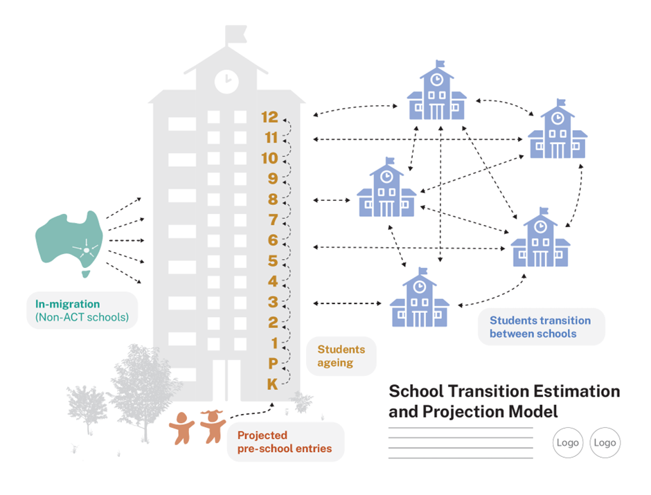
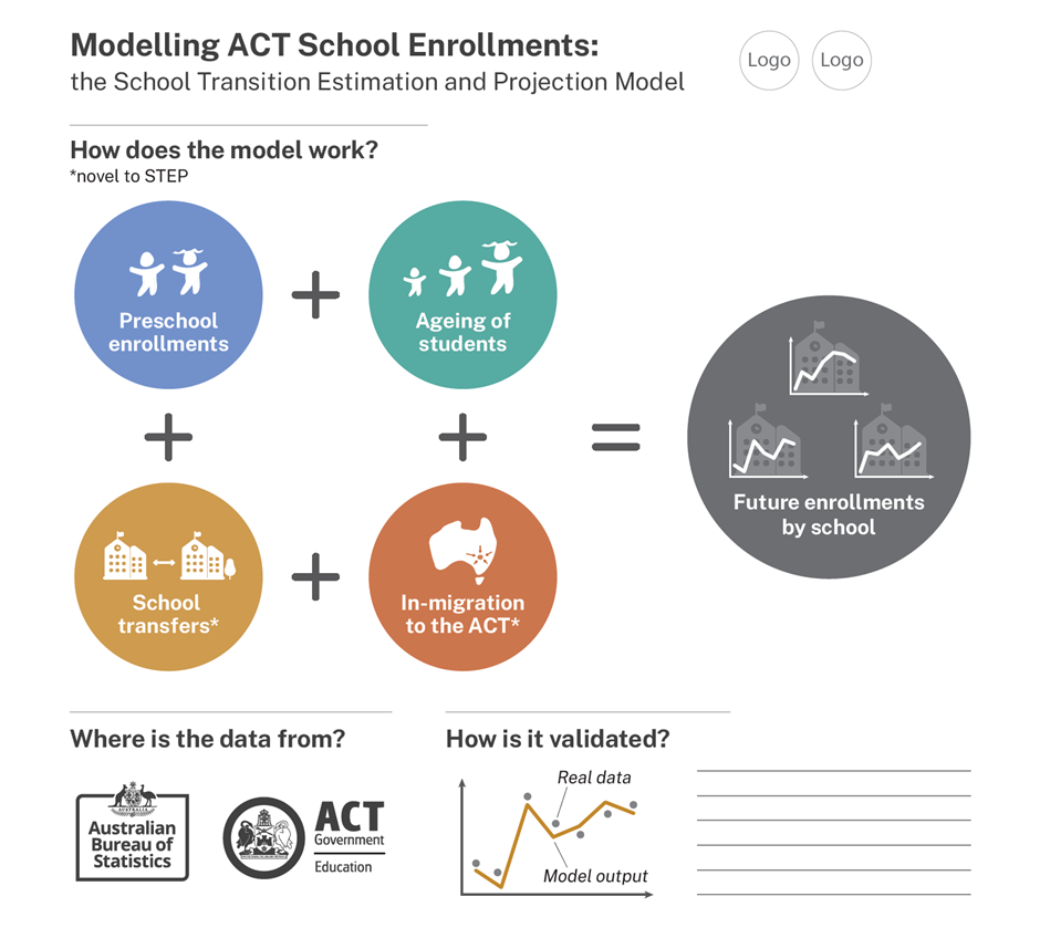
Last year I collaborated with Prof Edith Grey, Prof James Raymer, and Dr Qing Guan from the School of Demography at the Australian National University on a project to visualise their school transition model (‘STEP model’). Their work looked at how to better model movement within and between schools in the Australian Capital Territory. They do some incredible, impactful research.
I bring this up because I wanted to share the first and final versions of the figure we created. The first one is rough and not aesthetically cohesive. This is by design, though. I purposely don’t put much effort into making the first drafts look amazing because this stage is more about ensuring I have captured the key concepts and messages. I usually do lots of initial sketches for ideas. Then I present 3-4 concepts to my clients, from which they pick one to develop more (two of these concepts are below). The chosen concept goes through 3-5 rounds of revision before we are at the final version.
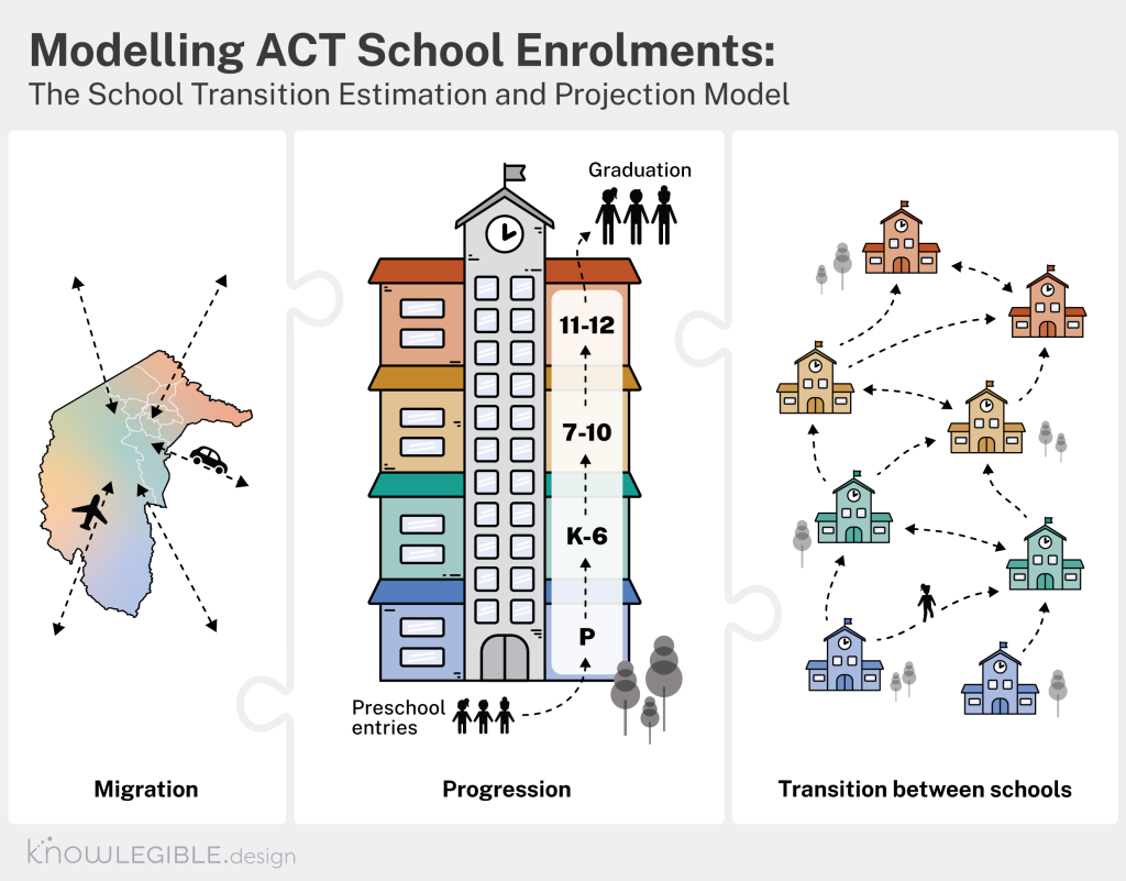
Importantly, each revision of the figure is done collaboratively with my clients – just like working iteratively and collaboratively with your co-authors to write a paper.
Getting feedback is critical because you are so deep in the work that you can’t stand back from it. William and Colomb say it best: “We cannot judge our own writing as others will because we respond less to the words on the page than to the thoughts in our minds.”2
This is also related to ‘The curse of knowledge‘, where you assume that others will read/see what you do because you have the knowledge behind the visual. Check out this post for more.
Key take-aways…
At the end of the day, a lot of the editing tools you use to improve your writing apply to creating visuals:
- Cut out any unnecessary elements and minimise redundancy. This will help clarify your message and make for a more eye-pleasing design.
- Ensure you have a strong message and a clear narrative. Without these, you will struggle to use visualisation techniques effectively.
- Get feedback from multiple people multiple times. You know your subject matter too well, and you can’t understand what others see unless you ask them.
- Practice makes perfect. Keep going, keep trying, and you will get better!
I want this blog to be useful and interesting for you! If you have a question about creating visuals for science, or a concept you would like to learn more about, reach out on Twitter by tagging me @KnowlegibleDsg. If I don’t know the answer, we’ll figure it out together.
Want to know when a new post comes out? Join the mailing list here.
Don’t forget to share this with others who would find this helpful!
Thanks for being here,