
Like many researchers, I want to communicate my science as clearly as possible.
I have a research background in marine reserves and fish population dynamics. In other words, I translate ecology into maths to help us better manage and conserve fish stocks. It’s a massive field, and I’m a small fish in a big pond, so I don’t have high ambitions that my science will profoundly change the world. But I do want it to have some impact. All science should have some impact. Otherwise, what is the point of all that hard work and heartache?

I recently attended a conference with a panel discussion on making an impact. After initial talk about the success of the well-established panellists in changing national and state policies (this felt incredibly overwhelming to half the room, which were students or early-career researchers), the discussion circled around to talking about impact in a more rounded way: the change created by your work. This change can be as ‘small’ as adding knowledge to your field or ‘large’ as influencing major policy. Not all our work will directly change the world, but it can make a lasting impact by contributing to the critical mass required for change.
To have an impact, we need to communicate effectively. Good research is pointless if no one understands and engages with it – including other researchers.
We are taught two basic communication skills in our scholarly training: writing and speaking—great things to learn to do well. Yet have you noticed that no matter how excellent papers and talks (and tweets and posts) are, they are nearly always accompanied by visuals (graphs, diagrams, pictures, etc.)?
Why? Because visuals have incredible power to communicate complex ideas in ways that words can’t. Our brains love visuals. For example, visuals naturally attract our attention before other forms of communication1; if a presentation has slides (almost always), you will focus on the visuals first and the speaker second (sometimes to the speaker’s detriment)*.
*Note, this is mainly anecdotal. I am only just delving into this literature, so I would love to know if anyone has some good reading on this.
Science also lends itself particularly well to visualisation2. As researchers, we aim to make the complex and mysterious, tangible. From the structure of DNA to the intricacies of the universe, visuals have been the foundation of sharing discoveries and conveying knowledge. Data visualisations have also become standard in gaining clarity and insight into complex data.

Visuals are ubiquitous and essential in research.
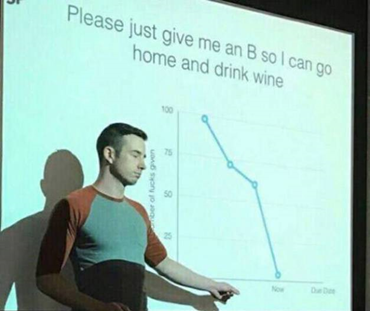
But, and I hate to say it, many of them are just … terrible. In both design and purpose.
Does this matter? Yes! Why? Because terrible visuals make our brains work harder than they need to, nullifying their purpose. More on that to come.
I don’t blame us for creating visuals sub-par to our writing or presentations skill. We are not taught how to create (design) good visuals to the same extent that we are taught how to write or present (or science).
Poor visual literacy is rife in research. This is especially true in fields like ecology, where our exposure to beautiful graphics is often limited to natural history drawings – which are important in their own right, but not applicable to all research communication. This blog is my attempt to do something about this.
As is the nature of these things, this blog will change and evolve over time. Here at the starting line, I have grand ambitions to write about everything and anything that could help you: visual communication theories, tips for using programs, and case studies of my work with clients.
I am a trained researcher and self-taught graphic designer (no small thanks to hundreds of hours of online courses). I am deeply passionate about bettering my visualisation skills and helping others do the same. Most of what I share will be things I learn as I grow my business and practise my craft.
Be warned, there may also be pictures of my dog, Cashie.
I want this to be useful and interesting for you! If you have a question about creating visuals for science, or a concept you would like to learn more about, reach out on Twitter by tagging me @KnowlegibleDsg. If I don’t know the answer, we’ll figure it out together.
Want to know when a new post comes out? Join the mailing list here.
Don’t forget to share this with others who would find this helpful!
Lastly, a massive thank you to my beta readers for your incredibly helpful feedback on the first three posts and for helping ease the terror of starting a blog.
Thanks for being here,