
Why designing good visuals is like writing a good article
Think about the last excellent paper that you read. What do you remember from it? Like most people, you probably don’t remember the exact words or phrases. Instead, you probably remember the key ideas that the paper was about. Good writing is not obvious. It fades into the background, acting as a vessel for […]
Program Tips: Helping you create better visuals – Part 2
First of all, a huge thank you to everyone for your lovely comments on my previous post about program tips! It’s encouraging to know that these posts have been helpful, and I hope that they continue to be so😊 This post follows on from my previous one about design program tools that can help improve […]
Program Tips: Helping you create better visuals – Part 1
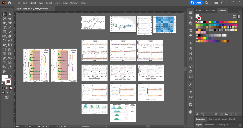
Every time I give a talk or presentation, someone asks what design program I use. “Adobe Illustrator”, I dutifully answer with a slightly sinking feeling. The sinking feeling is because I find this answer very misleading. I do use Illustrator (mostly). However, I think you are really asking, “How do I learn to do what […]
Why knowing too much can be bad for communicating your science
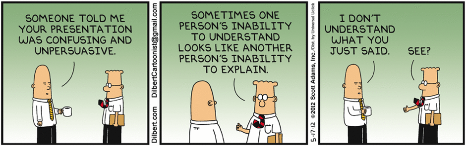
Of all the scientific information design work I do, visually communicating my own research is the hardest by far. I never do as good a job of it as I do for other people. Honestly, it’s a little embarrassing. Visual abstracts and infographics of my research should be outstanding examples of my abilities as a […]
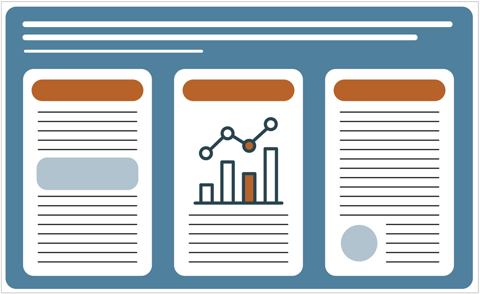
Visual Hierarchy: How to help others navigate your graphic
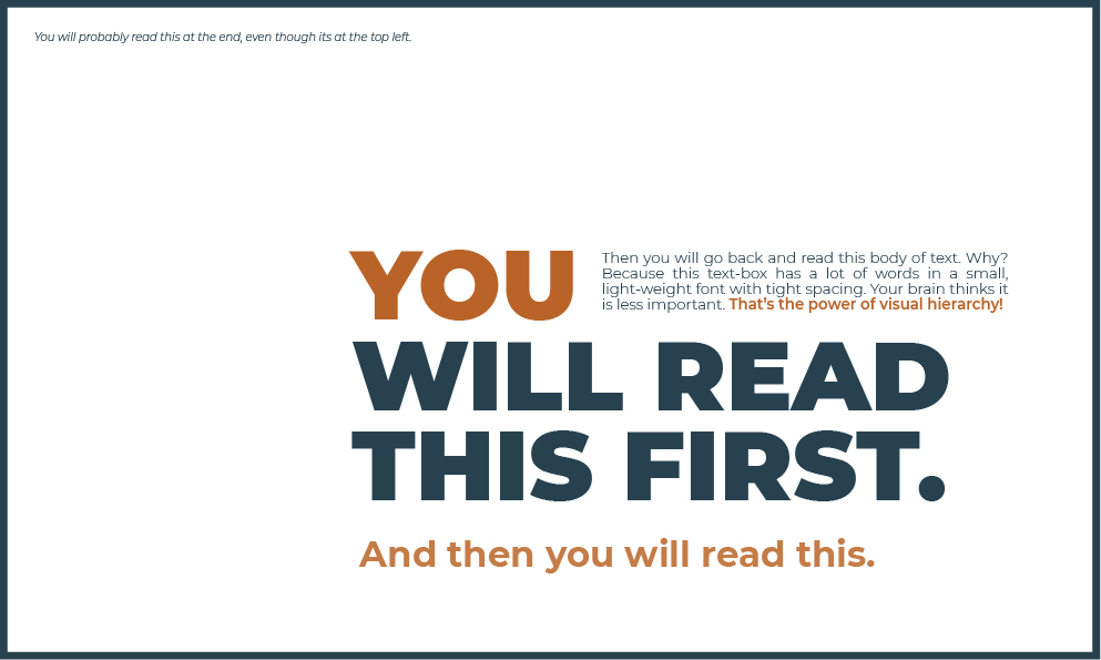
My dad is terrible at telling jokes. He is the type of joker who tells the punchline straight up. Sometimes, he’ll get halfway through and then, bam, punchline. Occasionally, he’ll forget the punchline completely, leaving you feeling awkwardly confused and slightly annoyed. Dad’s terrible at jokes because he forgets the fundamental rule: follow a well-defined […]
Why designing good scientific visuals matters
At the end of last year, I gave a workshop at ComSciCom RWM 2021, and an attendee said, “I usually think if [my visual] is pretty, people will look at it longer and eventually understand it”. I used to think the same thing, but about writing. If I used big fancy words to convey my […]
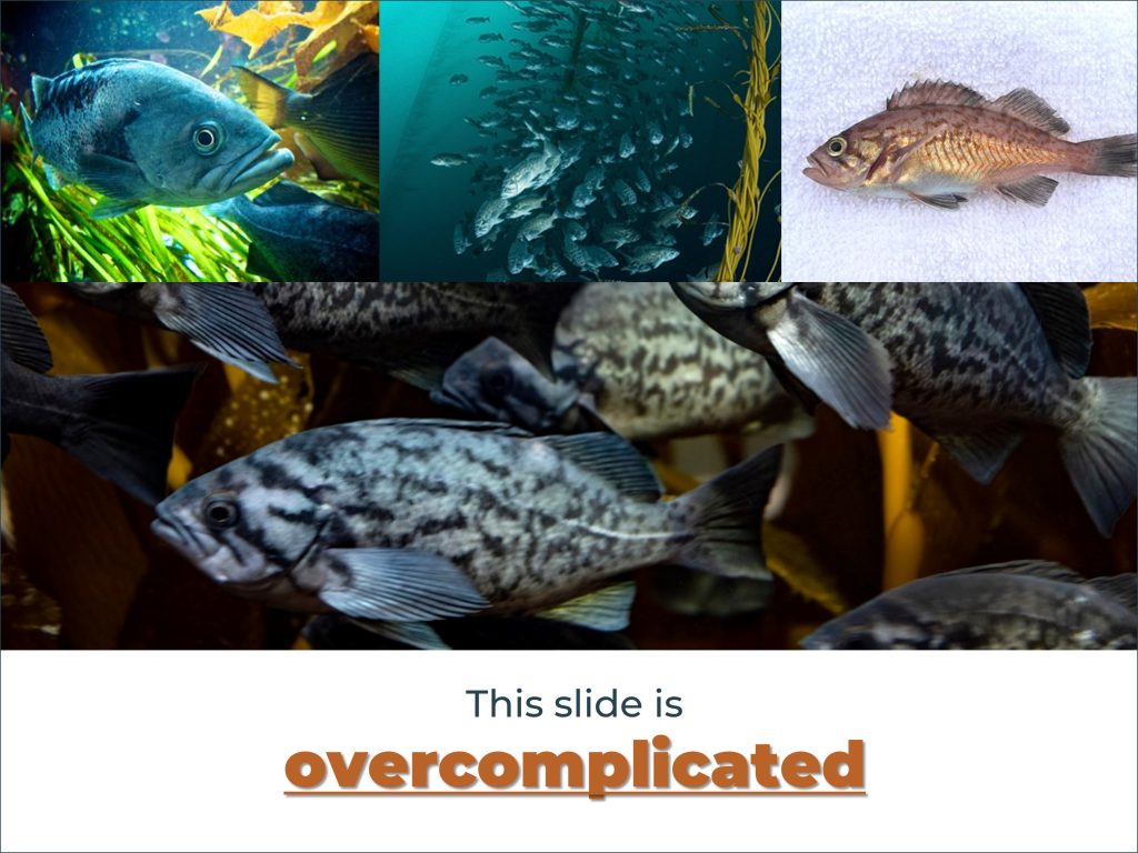
Welcome! And why we* need a blog on creating better visuals

Like many researchers, I want to communicate my science as clearly as possible. I have a research background in marine reserves and fish population dynamics. In other words, I translate ecology into maths to help us better manage and conserve fish stocks. It’s a massive field, and I’m a small fish in a big pond, […]