
Of all the scientific information design work I do, visually communicating my own research is the hardest by far. I never do as good a job of it as I do for other people. Honestly, it’s a little embarrassing. Visual abstracts and infographics of my research should be outstanding examples of my abilities as a designer and visual communicator, but they often aren’t.
The problem is that I know too much. You do, too (regardless of how imposter-y you feel).
Science requires us to be experts. We need to deeply understand our fields, knowing the evidence for and against any argument. We must think of all the possible scenarios, caveats, ifs, ands or buts. PhDs take years because we need the time to immerse ourselves deeply enough to be confident moving forward as experts.
If being experts is our job, why is knowing too much a problem?
Because once we know something, we find it hard to imagine what it was like not to know. After years/decades of research, we struggle to re-create a beginners’ mindset1. This makes it challenging to clearly communicate our work to others. We tend to overestimate how clearly our message is received and understood.
This inability to put ourselves in the shoes of not knowing has been coined “The Curse of Knowledge”2.
Here is a great example.
Example: Tappers and Listeners
During her PhD at Stanford, Elizabeth Newton used a brilliantly simple game to demonstrate our tendency to overestimate others’ ability to understand us 3. In the game (experiment), Newton assigned people to one of two roles: “Tappers” and “Listeners”. Tappers were asked to tap out the rhythm of a well-known song like Happy Birthday or Baa Baa Black Sheep (by knocking on a table). Listeners were asked to guess the song.
Imagine you are a tapper. How likely would you estimate that your listener can guess your song? One in two times? One in five? One in fifty?
If you said one in two, you would be on par with the estimates made by the tappers in Newton’s experiment. If you identify as male, you probably guessed a little higher than your female counterparts (56% vs 44% in Newton’s study).
Recognising that this experiment is about overconfidence, would you like to revise your estimate?
In Newton’s experiment, 40 tappers tapped out 120 songs to 40 listeners – that’s a lot of tapping! Listeners correctly identified a grand total of 3 (2.5%)! I’m curious how many of them were lucky guesses.
This is the Curse of Knowledge. Tappers hear the tune of the song in their head as they tap. They can’t imagine what it’s like to only hear the tapping (i.e., not know the tune). The issue is exacerbated because the songs are well-known; how can the listener not recognise them?
Try this out for yourself. Go and tap a well-known song for someone and see if they can guess it. Try to imagine what it’s like to not know the song as you do this. It’s harder than you think!
Implications for visual communication
The Curse of Knowledge concept originated in economic and market settings, where well-informed decision-makers often fail to predict the actions of less-informed agents. That is, they allow their own knowledge to guide predictions rather than recognise that others don’t have that information and won’t be using it in their predictions4.
Now, the Curse of Knowledge is a well-recognised and well-studied psychological phenomenon, appearing across multiple domains.
Here’s a communication example that I particularly love. Suppose you know that an ambiguous sentence like “that restaurant was marvellous, just marvellous” is meant to be sarcastic. You will tend to assume others will also see it as sarcastic despite knowing that the sentence can be read non-sarcastically5.
For science communication, the most relevant work is that by Cindy Xiong (now at the University of Massachusetts) and colleagues on data visualisation and (mis)communication6.
Xiong presented people with a line plot (below) representing artificial voting intentions over time for a fictional election with four parties.
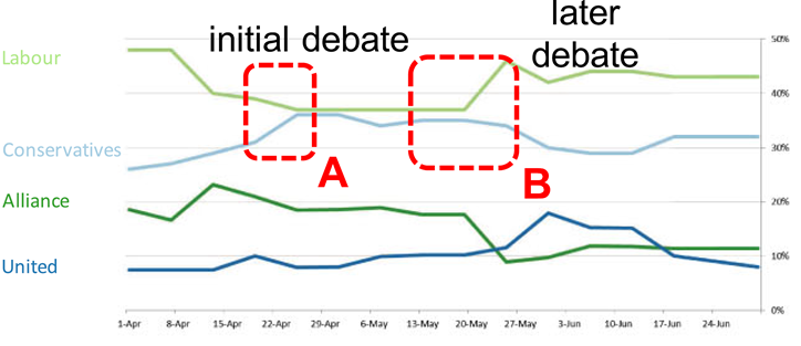
Alongside the plots, participants read a story outlining the interactions of two parties across two debates. For example, the story might read something like ‘the Labour candidate initially had a healthy lead in the polls but, during the initial debate, they insulted the spouse of the Conservatives candidate’. I.e., participants were primed to see a particular story.
The participants were then asked to ignore their knowledge of the debates and predict what naïve viewers would find most visually salient on an unannotated version of the plot. This is an example of their answers (red areas indicate features that were predicted as visually salient):
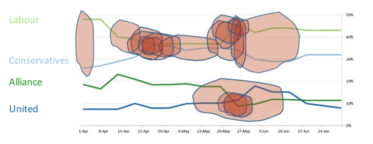
In general, participants in Xiong’s study identified features that were highlighted in the story as more visually salient than other features. The figures, however, were designed to have several equally salient features (as tested on non-primed participants).
Xiong’s work wonderfully demonstrates that when you are primed to see one pattern in the data, you’ll believe that others will see the same, even if there are other noticeable patterns.
This has vast implications for communicating your data!
Think about it. You have been working on a dataset for months, analysing, plotting, and writing about it. When you finally present your work, you know the story of the data inside-out. You flash the figure up on a slide and launch into a discussion of the implications of your findings. Or, you include the plot in a paper and write about the implications in the discussion.
However, your audience may not immediately see what you see. Instead, they may be focusing on a totally different feature of the figure to what you are discussing and miss the point you are making.
As I’ve discussed before, reducing the amount of thinking that your audience needs to do before getting to your key point is crucial to good communication. The Curse of Knowledge threatens this by causing you to assume others will see what you see in your figure.
What can you do about it?
The Heath brothers have a whole book on ways to overcome the Curse of Knowledge and clearly communicate your work; “Made to Stick: Why some ideas survive and others die”7. Go read it, it’s excellent.
In the meantime, here are some things you can do.
- Distil your work down into one clear message before creating your graphic. This applies to everything from graphical abstracts to data visualisation. By not clearly presenting a key message in your visual (see also my post on Visual Hierarchy) you’re assuming your audience knows more than they do. You are asking them to join the dots when that is your job. The Message Box by science communication professionals COMPASS is a fantastic tool that can help here.
- Experiment with ways to communicate your knowledge in concrete, relatable terms. The literature on experts shows that as expertise increases, mental representations of concepts become more abstract8. That is, as we develop expertise, we build conceptual models in our minds that form the basis for our understanding. We contextualise any new knowledge within this framework (see my comments on Cognitive Load). Novices lack this conceptual model and need other ways to absorb the knowledge you’re presenting. This is where analogies and storytelling, or in the case of visuals, icons and pictorials, can be particularly helpful.
- Guide your audience through your visual. Your key message might seem glaringly obvious to you, but as Xiong’s work points out, not everyone will see the same patterns in what you are presenting. If there is a particular point that you want to highlight, annotate it! The Data Visualisation experts have been doing this for years. Here is a great example:
- Show your visual to people who are not experts in your field (i.e., a novice) and ask for feedback about what they understand to be the main take-home. ‘Expert/novice in your field’ is a shifting definition – it’s relative to the target audience of your visual. Suppose your visual is a figure for publication in a journal. In that case, you can assume that your audience will have experience interpreting it and a lab colleague who doesn’t know much about your work or isn’t studying the same topic is a novice. However, if your visual is an infographic for public outreach, then that lab colleague is now an expert (they have research experience), and a novice will be a family member or housemate.
Final words
The Curse of Knowledge leads us to believe that others will interpret our message exactly as we see it. However, this exact interpretation is the exception, not the rule. We spend a lot of time in science concerned with the message we are trying to convey.
We also need to spend some time considering how our message is interpreted.
If you want to really sink your teeth into some relevant literature, Martin Sewell from Cambridge University has put together this great list on behaviouralfinance.net. The site is a fantastic catalogue of the major works and important heuristics in behavioural finance – yes, some are very relevant to visual science communication.
I want this blog to be useful and interesting for you! If you have a question about creating visuals for science, or a concept you would like to learn more about, reach out on Twitter by tagging me @KnowlegibleDsg. If I don’t know the answer, we’ll figure it out together.
Want to know when a new post comes out? Join the mailing list here.
Don’t forget to share this with others who would find this helpful!
Thanks for being here,